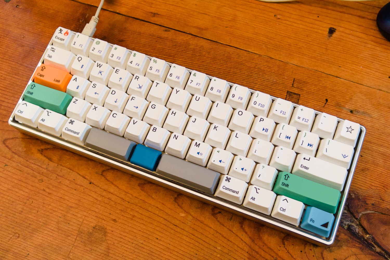
I haven't been in this obsession hobby very long, but I feel like I've been on an accelerated track. I pre-ordered a WhiteFox, pre-ordered the Kishy Model F77 (both of which I'm still waiting on!), bought a Matias Mini Tactile Pro, bought a vintage IBM PC-XT keyboard off eBay, bought a Carpe JD45... and then realized nobody was making what I really wanted, and I'd just have to build it myself.
Soon the Keyboard-Layout-Editor.com became my new favorite computer game. And here is the result:

This keyboard has two salient features that I couldn't get from off-the-shelf keyboards. The first is the split spacebar, which I have wanted for years and years. I always felt putting the backspace key under my left thumb would make more more sense than the conventional location.
The second feature that I'm proud of here is the nav cluster. This arose almost by accident. When I first saw the Banana Split 60 on geekhack.org, I was put off by the center key in the middle of the spacebar. Who ordered that? Isn't that just awkward? Then I started thinking about what I would do with it. Well, it could be another Fn key... And then the light dawned. Look at this:
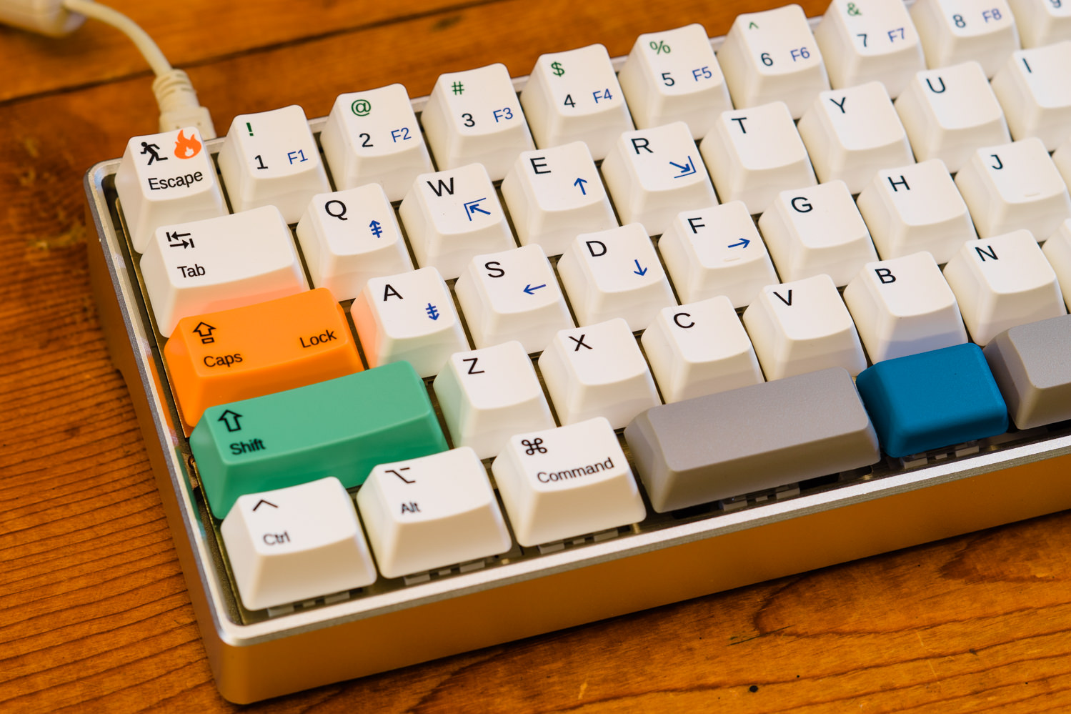
All I have to do is press down with my left thumb on that blue center key, which is already the most natural place for my thumb to rest, and then I have all the nav keys under my fingertips. I can do all the navigating one-handed, and I don't have to shift my hand from its home row typing position at all.
Navigation keys--and especially arrow keys--have been a nagging problem with 60% layout keyboards for a while. You can take away the number pad, and most people don't mind. You can move the F-keys onto a layer, and most people are OK with that. Take away their arrow keys, though, and there is a cry of pain. So, we've seen 65% designs where some nav keys are added back and scrunched up against the right side. We've seen 60% designs where a set of arrow keys are shoehorned into the lower-right corner, compromising the shift and modifier keys in that area. To me, that's awkward. I think this is going to be a better answer. After a brief adjustment, this layout can be more convenient than dedicated nav keys.
Well, that's the pitch. Here's the nitty-gritty details...
At first I wanted to build this on a Banana Split 60 PCB, but I had already missed the first production batch, and I faced an uncomfortable wait for round two. (I'm still eager to see what improvements show up with that, though!) Meanwhile, I discovered that the KBDfans DZ 60 PCB also supported the layout that I wanted to use. So, I only had to wait on the fabled Slow Boat From China for that. Meanwhile, I refined my plans and collected other parts.
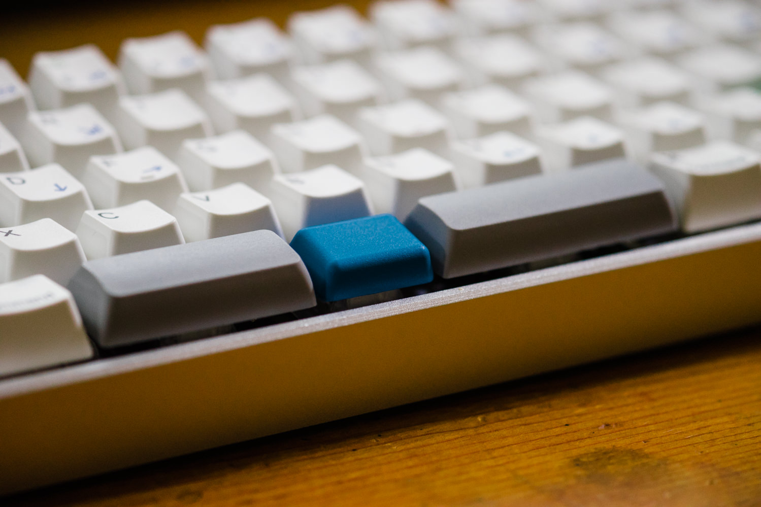
This layout with the 2.25 | 1.25 | 2.75 split was designed to work with standard keycaps, so most people have been using blank (or not!) shift keys as spacebars. I wasn't happy with that. I wanted real spacebars with a convex profile. I briefly toyed with the idea of 3D printing, but then I discovered a source of XDA profile short spacebars on AliExpress. These are PBT, they're high quality, and they are only available in gray. I decided I could live with gray.
Incidentally, I experimented with blank G20 profile shift keys from Signature Plastics. The G20 profile is not bad, but the keycaps I received were noticeably warped. Tut tut, SP! The good news is, a G20 1.25u keycap is perfect for the center Fn key. Especially when flipped backward, it's quite comfortable to rest the side of my thumb upon. It's also nice that it's different in shape and feeling from the spacebars, so it's easy to keep my hand and my thumb oriented by touch.
For switches I picked the new Kailh BOX White clicky switches. These are supposed to be dust and water resistant, and they have a great feeling and double-click sound. My only quibble is that they are sprung a bit light for my hands, and I should have got the slightly heavier BOX Pale Blue version. There's also a super-heavy "thick click" version coming real soon now that I must try. I also want to build a keyboard with BOX Burnt Orange tactile switches some time.
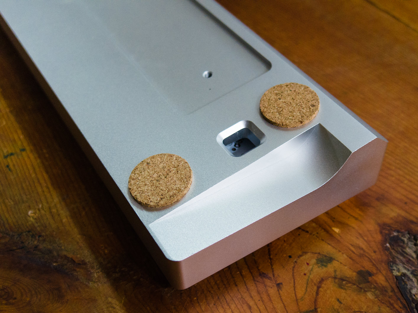
The case is from Team Wolf and it's super heavy duty. That wedge-shaped base of solid aluminum makes it impossible to flex, and it feels like a brick. You can see the cutout for the optional polished steel weight, which I have left out because this thing is plenty heavy without that! I'm not sure whether this is truly my "end game" case, but it's definitely in the higher class.
As for the rest of the keycaps, I had those custom printed by WASD. This is one of the few places to go for a truly custom keycap set. I was able to design the legends in Inkscape and upload them. I'd never used Inkscape before, but it's not that hard to pick up (especially for someone with GIMP experience), and WASD provide a template that is very helpful. It includes instructions, templates, and all their standard legend options, so it's easy to mix them with your own additions. To get all the keys I needed, I had to order a TKL set, but that gave me the opportunity to have a bunch of extra and novelty keys printed.
The printing is coated with a clear UV-cured resin that is supposed to be very tough. The keycaps themselves are thin ABS material. The colors are even, the molding is sharp and clean, and I'd say they're good quality--if you are OK with thin ABS and surface printing. I know some guys think every keyboard must be built like an IBM XT for years and years of constant pounding on, and that's not what we're looking at here. These keycaps just aren't heavy duty like that. For my purposes I believe they should be Just Fine.
Odds and ends...
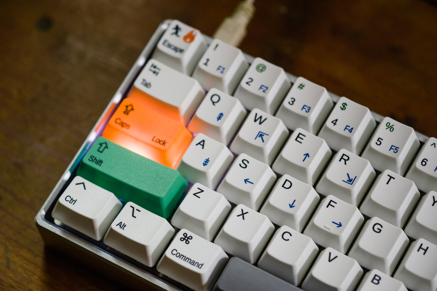
That Caps Lock key has a big gap between Caps and Lock because I wanted the LED indicator to show through, which in retrospect was not a serious concern. I'll fix that next time! Also, it's convenient to make Caps Lock work as an extra Enter key on layer 1. That way when picking from one of those list gadgets, I can use E and D to find the item I want, and Caps Lock to select it with one hand.
I selected media keys that I thought would be easy to remember: M for Mute, P for Pause/Play, and adjacent keys for VolUp, VolDn, Prev, Next. The backslash key also serves as Insert, which is a key unknown to the Mac, but I might need it someday (once in a blue moon!) when using Ubuntu. I find that Mac layout keyboards work very well with Linux.
The left spacebar is, of course, Backspace, and with Fn it becomes Delete (or Forward Delete to us Mac loonies). Right now I have the upper-right star (or "any") key serving as another backspace, though I'll probably change it sometime. It could be anything. (Yes, the real problem with a 60% layout is having more keys than you know what to do with!)
The DZ 60 PCB comes with RGB underglow already installed, and I also added white LEDs to all the switches (because why not?). By default these are all controlled on layer 1, but of course I had other plans for layer 1. I copy-and-pasted all the LED controls to layer 2, then made Fn-L (for LED) take me to layer 2, and Esc takes me back to layer 0. This works pretty well.
For easy reference, I've decided to call this the Zo64 layout. You can call it whatever you want. I would be gratified if anybody else builds this layout and finds it useful too. There's nothing proprietary, it's all off-the-shelf components and just putting 2+2 together.